

Nova Theme Guide
Nova Introduction
Banner Image Sizes
Main/feature banner: 740 x 800
Four mini-banners: 740 x 375
Two highlight banners: 1122 x 150
Nova Orbit
Main/feature banner: 1811 x 381
Four mini-banners: 586 x 281
Square banner: 586 x 586
Nova Terra
Main/feature banner: 1184 x 383
Four square banners: 500 x 500
Two right-side banners: 800 x 245
Long bottom banner: 1811 x 200
Nova Solar
Carousel mega banners: 1920 x 1080
Eight mini-banners: 740 x 350
Four Layout Summary
Nova Clean is a fully conversion rate optimized style, using a contemporary, precise layout with easy-to-read fonts. Instantly brandable using a customizable color palette, simply add your logo and products. Suitable for any and all e-commerce industries.
Nova Orbit
Nova Bold gets right to the point. Limited use of white space and thick, strong lines make this style great for sporting goods, tactical gear, and other down-to-business industries.
Nova Terra
Nova Elegant is delicate, spacious and chic. Let your products or images take center stage with fine lines and a simple, polished background. This beautiful Nova layout is great for florists, jewelers, and anyone with an artistic product line.
Nova Solar
Nova Modern is technology-forward, with a full-width mega banner to showcase your brand, service or number one product. Using more advanced components and animations, this style has the ‘wow’ factor down pat. Great for technology companies, or anyone who needs to make a big first impression.
Frequently Asked Questions
Go to Products on your BigCommerce dashboard. In list view, you’ll see a star on the far right of each product. Simply click the star next to the product you’d like to feature on the homepage of your site, and the star will turn blue to indicate the change was made. Featured products will show up immediately on your homepage after a refresh (no “Save” needed). If the number of featured product you’ve chosen to show in the theme customizer is less than the number of products you’ve marked as featured, your homepage will rotate through your featured products, showing new ones on each new visit.
How can I add more reviews to the Testimonials section of the homepage?
Go to Marketing > Banners on your BigCommerce dashboard. Click Create A Banner. Name your banner/testimonial, and then add your review to the Banner Content section, including quotation marks and the review-givers name if desired. Next, select to show this banner on your Home Page. Finally, scroll down and select Bottom of Page for banner location. Click Save.
Do I need the epicToolbox with the Nova theme?
No, though we highly recommend it for all the added features you’ll enjoy with your Nova theme. And currently, the epicToolbox only integrates with Nova. We are also working on a version of the epicToolbox that integrates with other BigCommerce themes in the future….stay tuned!
Nova Design Guide
Editing your theme will change your website, so do so at your own risk. If you are unsure about a certain change, please contact us first.
Customizer Settings
New Settings
New settings will appear here when released
Color and Font Palette
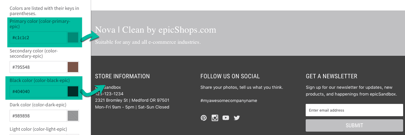
COLOR PALLET
Primary color (color-primary-epic) – This is the hex code for the color you’d like to appear as the primary color for your site (navigation menu).
Secondary color (color-secondary-epic) – This is the hex code for the color you’d like to appear as the secondary color for your site.
Black color (color-black-epic) – This is the hex code for the color you’d like to appear as black for your site. NOTE: most websites do not use true #000000 for their black
Dark color (color-dark-epic) – This is the hex code for the color you’d like to appear as the dark color for your site (usually a version of dark grey or brown).
Light color (color-light-epic) – This is the hex code for the color you’d like to appear as the light color for your site.
White color (color-white-epic) – This is the hex code for the color you’d like to appear as the white color for your site.
Call-to-Action color (color-cta-epic) – This is the hex code for the color you’d like to appear as the call-to-action color for your site (search button, back-to-top button background, product hover).
Custom color one (color-one-epic) – This is the hex code for an additional, custom color you’d like to use for your site (optional).
Custom color two (color-two-epic) – This is the hex code for a second additional, custom color you’d like to use for your site (optional)
Custom color three (color-three-epic) – This is the hex code for a third additional, custom color you’d like to use for your site (optional).
Custom color four (color-four-epic) – This is the hex code for a fourth additional, custom color you’d like to use for your site (optional).
FONT PALLET
Primary Font (font-primary-epic) – choose from drop down selections to assign the primary font for your site. Mainly used for body text.
Secondary Font (font-secondary-epic) – choose from drop down selections to assign the secondary font for your site. Mainly used for header/title text.
Script Font (font-script-epic) – choose from drop down selections to assign the script font for your site. Used for text logo, and can be assigned throughout site as desired.
Style Picker
When you choose your main Nova layout (Clean, Bold, etc.), the below fields will all default to your chosen layout. If you’d like to change the style of any of the below areas, simply click the dropdown and choose a new style.
Product Card Style – choose a Nova layout (Clean, Bold, Elegant or Modern) to use for your homepage and category page product cards.
Testimonial Style – choose a Nova layout to use for the testimonial section on your site’s homepage.
Product Page Style – choose a Nova layout to use for you site’s product pages.
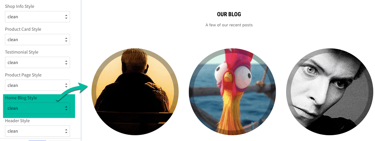
Home Blog Style – choose a Nova layout to use for your homepage blog preview section.
Header Style – choose a Nova layout to use for the header section of your site. Displays up at the top of every page.
Footer Style – choose a Nova layout to use for the footer section of your site. Displays at the bottom of every page.
Mega Banner Style – choose a Nova layout to use for the banner section (above the fold) on your site’s homepage.
Global
PRIMARY BUTTON
Text Color – changes the color of the text displayed on the site’s primary call-to-action buttons (such as ‘Add to Cart’)
Text Hover Color – changes the color of the text displayed when a cursor is placed over the site’s primary call-to-action buttons
Text Active Color – the color of the text when the button is clicked. This usually displays very quickly, and may not appear in all browsers
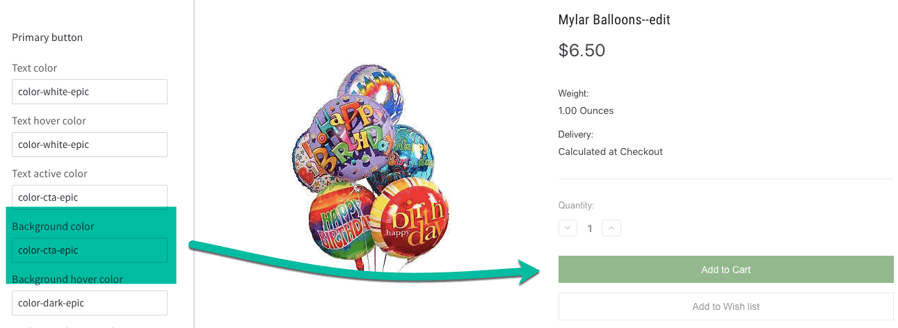
Background Color – changes the background color of the site’s primary call-to-action buttons
Background Hover Color – changes the button background color when a cursor is placed over the site’s primary call-to-action buttons
Background Active Color – changes the color of the background when a primary button has been clicked and is active
SECONDARY BUTTON
Text Color — color of the text displayed inside these buttons
Background Color — changes the color of the button behind the text
Carousel & Mega-Banner
MEGA BANNER SETTINGS
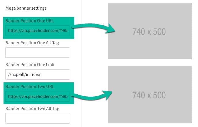
Banner Position URL – changes the image in the selected banner position. Must use the shortened URL of an image already uploaded to the Image Manager (cannot exceed 64 characters – ex: /product_images/uploaded_images/myimage.jpg). Refer to ‘Banner Image Sizes’ for a guide on banner dimensions for all Nova layouts.
Banner Position Alt Tag – assign alt-tags to banner images
Banner Position Link- assign a clickable link to banner image positions. Note: URL cannot be longer than 64 characters. Shortened/partial URLs are recommended (ex: https://goo.gl/RiULmL or /sports-equipment/)
CAROUSEL SETTINGS
Show Carousel — toggle the carousel on or off
Allows image to stretch on large screens — prevents cropping of large carousel images if the viewing screen is wider than 1261 pixels
Background Color — changes the color of the box overlay on the carousel
Title Color — changes the color of the large text on the carousel
Description Color — changes the color of the smaller text on the carousel
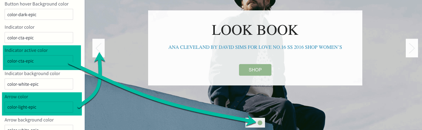
Indicator Color — changes the color of the empty dot below the carousel if there is more than one slide
Indicator Active Color — changes the color of the full dot below the carousel if there is more than one slide
Indicator Background Color — changes the color of the box behind the dots below the carousel if there is more than one slide
Arrow Color — changes the color of the left and right arrows if there is more than one slide
Arrow Background Color — changes the color of the box behind the arrows if there is more than one slide
Customizer Settings
Header
EPIC TOP MENU
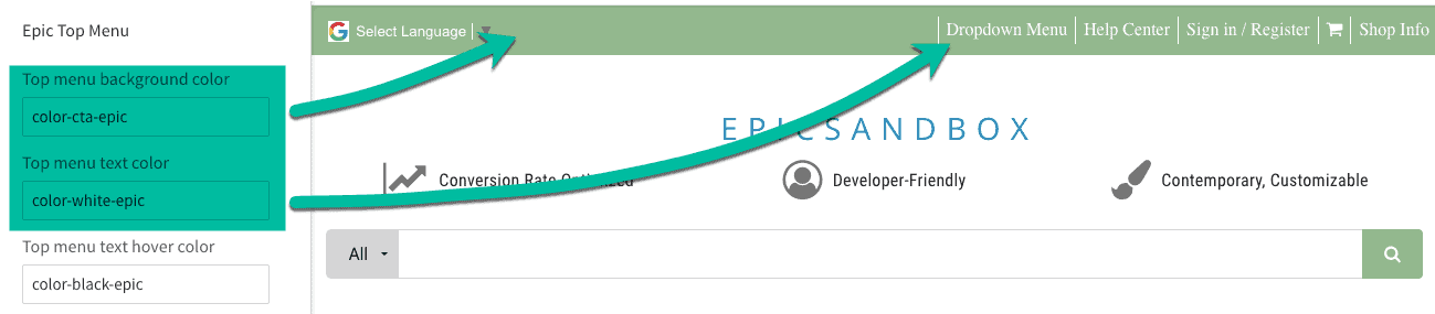
Top Menu Background Color – choose a color from the global pallet to apply to the top menu bar (ex: color-secondary-epic)
Top Menu Text Color – changes the color of the text in the top bar
Top Menu Text Hover Color – changes the color of the font when a cursor hovers over the text
Top Menu Border Color – changes the color of the borders between text in the top bar
Font Family – choose the font face for the top br. Default is font-primary-epic.
Font Size – change the size of the text displayed in the top bar
FIXED HEADER
Background Color – changes the color of the navigation bar that appears at the top of the webpage when user scrolls down
Text Color – changes the color of the text displayed in the fixed header when a user scrolls down
Border Color – changes the color of the border between links and search button in the fixed header
Fixed Header Search BG Color – changes the background color of the search button in the fixed header
Fixed Header Search Icon Color – changes the color of the icons displayed in the fixed header
SHOP INFO
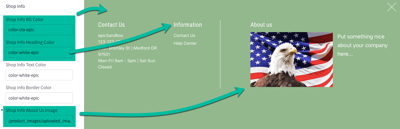
Shop Info BG Color – default is epic-primary-color. Changes background of Shop Info area on homepage
Shop Info Heading Color – default is epic-white-color.
Shop Info Text Color – default is epic-white-color.
Shop Info Border Color – default is epic-white-color
Shop Info About Us Image – type the name of the image in your store’s Image Manager you’d like to use (ex: storefront.jpg).
Shop Info About Us Image alt tag – create an alt-tag for your Shop Info image (optional)
MAIN HEADER
Header Background color – default is color-white-epic.
Header Shop Address – add you store’s physical address here, using “<br>” to add information on multiple lines
SEARCH OPTION
Search – check this box if you’d like the Search bar to display in your header
Search Button Color – default is color-cta-epic
CLEAN HEADER TABS
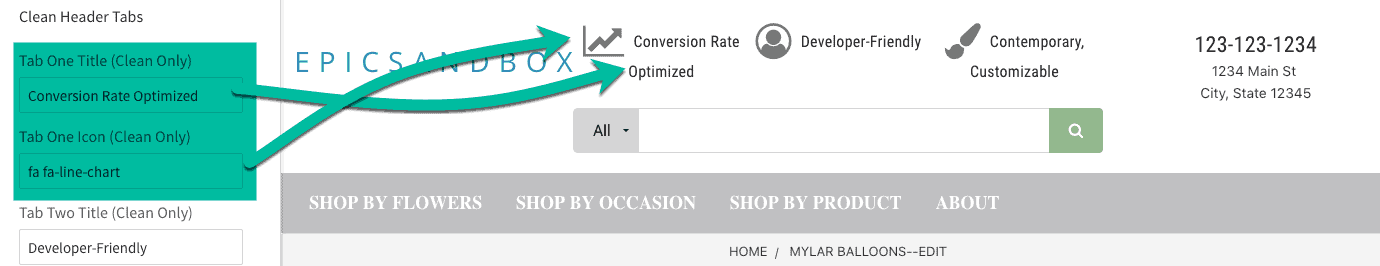
Tab One Title (Clean Only) – edits the text for the first (far left) of the three header snippets on the Clean layout (64 character max.)
Tab One Icon (Clean Only) – changes the font-awesome icon displayed to the left of the first snippet title
Tab Two Title (Clean Only) – edits the text for the second (middle) of the three header snippets on the Clean layout (64 character max.)
Tab Two Icon (Clean Only) – changes the font-awesome icon displayed to the left of the second snippet title
Tab Three Title (Clean Only) – edits the text for the third (far right) of the three header snippets on the Clean layout (64 character max.)
Tab Three Icon (Clean Only) – changes the font-awesome icon displayed to the left of the third snippet title
BOLD HEADER SETTINGS
Bold Header – cart button & icon color – changes the background color of the ‘View Cart’ area and cart icon on the Bold layout header only
QUICK SEARCH
Background color – changes the background color of the dropdown that appears when a user begins typing a query into the search bar.
Content Settings
BLOG SECTION
Background Color — set the background color for the blog preview section of the homepage
Home Post Limit — limit the number of post previews that display on the homepage
Home Post Button URL — link the call-to-action button in the home page blog preview area to your site’s blog page
Home Post Button Color — choose the text color for the call-to-action button
Home Post Button Background — choose the background color for the call-to-action button
Home Content Snippets
Display Content Snippets — toggle the Homepage Content Snippets on or off
HOME CONTENT SNIPPETS (1-4)
Title Text – type title (large) text for your chosen Content Snippet (limit 64 characters)
Body Text – type the body (sub) text for your chosen Content Snippet (limit 64 characters)
Text Color – change the color of your snippet’s text
Background Color – change the color of your snippet’s background (if not choosing an image)
Background Image – set an image for your snippet (if not using color)
Image Flip – choose an animation for your snippet (optional)
Font Awesome Icon Class – specify an icon from this library
Font Icon Position – choose to display icon on the top, bottom, right or left of text
Font Icon Size – choose the size of your font icon from the dropdown
Button URL – link Content Snippet to another webpage
Button Text – set text of call-to-action button
Button Text Color – set text color of Content Snippet button
Button Text Hover Color – set the text color that appears when a cursor hovers over the Content Snippet button
Button Background Color – set the color of the chosen Content Snippet button
Button Hover Background Color – set the background color that appears when a cursor hovers over the Content Snippet button
Payment Icons
Click the checkbox beside the payment icon location and brands you want to include in the header and/or footer.
Products
Show Quickview — toggle the feature for Quickview
HOME PAGE
Add Categories Sidebar to Featured Products – toggle on or off to add a left side bar with product categories links on the homepage
Contain Featured Products Section – toggle on or off to contain product section on homepage or allow full width
Number of Featured Products — set how many featured products to display on the home page, or disable this feature
Number of New Products — set how many new products to display on the home page, or disable this feature
PRODUCT DISPLAY MODE
Choose from dropdown – show products in grid view or list view on category pages
Home Featured Products Display – show products in grid view or slider view on homepage
PRODUCT PAGE
Number of Product Reviews – the number of product reviews displayed on product pages
Number of Related Products — the number of related products displayed below the product description
Number of Customers Also Viewed Products — the number of Customers Also Viewed products displayed below the product description
Product Swatch Image Sizes — specify the image size for Product Option: Swatch
PRODUCT SALE BADGES
Display Product Sale Badges — changes the display style of the sale badge
Text Color — change the color of the text on the sale badge
Badge Color — change the background color of the sale badge
Hover Badge Color (Excludes ‘Burst’) — change the background color of the sale badge when a cursor hovers over it
IMAGE SIZES
Main Product Images — specify the image size of the main product image on a product’s page
Thumbnail Image — specify the sizes of the thumbnail images that appear under the main product image
Zoomed Image — specify the size of the image when zoomed in for a closer view
Edit Header Tab Content (Clean Only)
- On the BigCommerce dashboard, go to Storefront > My Themes > Advanced (make sure Nova is your current theme). Choose Edit Theme Files from the dropdown.
- Next, go to templates > components > custom > header-tabs. Click on one of the three html files to edit the Clean header dropdown text: tab-one.html, tab-two.html or tab-three.html.
Change ‘About Us’ text on Shop Info module
- Go to Storefront > My Themes > Advanced. Choose Edit Theme Files from the dropdown.
- Next, go to templates > components > custom > about-us.html to edit the text that displays on the Shop Info module (link found in your website’s top bar)
Add Google Map to Contact Us page
- First, be sure you have created a Contact Us page. To do so, go to Storefront > Web Pages. If you do not have one listed already, click Create a Web Page. On the page editor, scroll down to Advanced Options and Template Layout File. Choose epic_contact from the dropdown. Click Save & Exit.
- Next, go to Storefront > My Themes > Advanced. Choose Edit Theme Files from the dropdown.
- To add your Google map, go to templates > components > custom > contact-page-map.html. There will be a placeholder link in this file. Replace it with your own embed link from Google Maps.
Create/Edit Help Center Page
- First, create a Help Center web page on the BigCommerce Dashboard. Go to Storefront > Web Pages > Create a Web Page. Once you’ve added the name of you page, scroll down to Advanced Options and Template Layout File. Choose epic_help-center from the dropdown. Click Save & Exit.
- Next, go to Storefront > My Themes > Advanced. Choose Edit Theme Files from the dropdown.
- To edit the Help Center file, go to templates > components > custom > help-center.html.