


")

Almost every e-commerce business knows that website navigation plays a big part when it comes to sales. Make a site confusing enough to browse and your visitors will leave immediately. But your website navigation structure also plays another role, and that is to support your brand.
Your website navigational structure is one of the constant things that people see when they go on your site and browse every page. So design, ease of use, and all the other unique attributes of your structure for navigating your site can affect how your visitors perceive your brand.
Website Navigation Best Practices
The number one rule to navigation is intuitivity. Your user shouldn’t have to think about how to use your site. The elements making up your navigational interface should be organized in such a way that your visitor can access all information he needs in an effortless manner. Here are some tips to follow to help your visitor navigate with ease:
1. Design it with your brand tone in mind.
Choose fonts, colors, and graphics that best exemplify your brand. If you’ve done your work right, the navigation menu or bar should blend in with the overall design of your site.
2. Have a consistent design and format for your interface.
Your interface should seamlessly flow from one page to another. Say your links turn blue or an underline appears when a mouse hovers over them, then that should be the style you follow on all navigation links within your site. Otherwise, your visitors may become confused about which texts are hyperlinked and which are not.
3. Optimize your site for mobile use.
Mobile devices make up about half of the web traffic worldwide. It’s important that when you design your website and its navigation menus, everything is optimized for the small screen too.
4. Keep it simple.
We don’t subscribe to the three-click rule (a myth that says a user is only willing to click three times in a website before abandoning it if they don’t find what they’re looking for). In fact, this rule has been discredited in many studies. But we can understand the logic behind it.
The idea behind the rule is to help people accomplish tasks on your site with as little effort as possible, which is correct. Keep your key information prominent and focus on creating clear pathways to answer all pain points on your user’s browsing journey.
5. Limit the number of menu items to seven.
Don’t put dozens of links on your home page. Choose a few main ones, give them descriptive labels, and put the other links under those. A streamlined navigation bar looks more organized and less confusing for users.
Types of Site Navigation
The type of navigation structure you use depends on your target market. You are designing your website around the people you cater to so choose what format you think is most accessible for them. Let’s take a look at some of the most common.
1. Horizontal Navigation Bar
This is one of the most common designs for letting users navigate around a website. All the major navigation pages are found on the site header and are listed side by side.
The nav bar on Lantern Audio’s website is one great example. Instead of the usual ‘About Us’ or ‘Contact Us’ sections, it features the five main content categories that the audience of the brand are more likely to want to know more about.

2. Drop-down Navigation Menu
Drop-down nav menus are designed for content-rich sites. If you want to list down all of the general links to your products or services without making your site look too cluttered, drop-down nav menus are ideal.
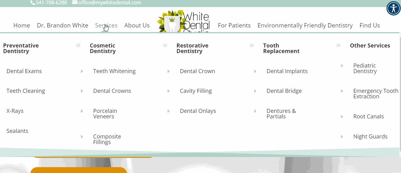
White Dental Studio’s website is a good example of a drop-down menu. When you hover around a primary link, in this case “Services,” all of the treatments and procedures the dental office offers are revealed.
3. Footer Navigation & Hamburger Navigation Menus
A footer menu is typically paired with a horizontal nav bar. Although in the example below, we chose to combine our footer nav with a hamburger navigation menu (three horizontal bars) instead. The purpose of the footer is to help visitors browse the site better by adding further navigation options at the bottom of the page instead of letting them scroll up again for the header links.
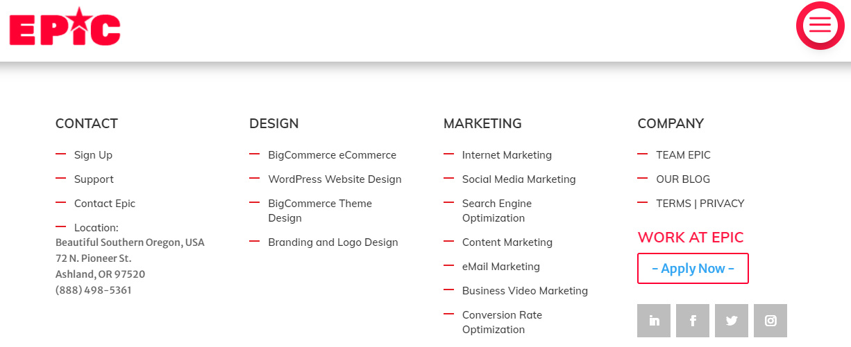
Meanwhile, the hamburger navigation menu makes the user interface (UI) look so much cleaner. It tucks away everything neatly so visitors are not distracted from the core functions you want them to see. It’s a very popular UI element that’s recognized by most since it’s incorporated into a lot of apps.
There is really no hard and fast rule to web navigation design. In the end, what works is focusing on the fundamentals. A good website is responsive, organized, and lets visitors browse through it easily and efficiently. Do remember that your visitor’s experience on your site is a huge factor in how that person will see your brand.
Need help giving your website navigation a boost?
Epic can help. We have been in the digital marketing and web design business for over 10 years, with more than 150 websites under our belt. We’re happy to create a digital experience that you and your customers will love. Drop us a note, and prepare to give your visitors a whole new browsing experience.