


5 Best Practices For Website Navigation Bar Design (And What Not To Do)
It may seem like overkill to write an entire blog about website navigation bar design, but in eCommerce if we’ve learned anything, it’s that small things can make a big difference. We’ve also learned that making use of as many SEO tips and tricks as possible will make a huge difference in the ranking and success of your business. If there’s a simple tool you can implement that will improve your business practices and help you rank higher in search engines, it’s always worth the time and effort.
Just to clarify: in this post we will be talking about website structural design. A website’s visual design can have a positive impact on SEO rankings and conversion as well, but in this post we will be strictly speaking about the organizational and structural design of your website and your navigational menu.
How Can A Good Website Menu Design Increase Your Conversions?
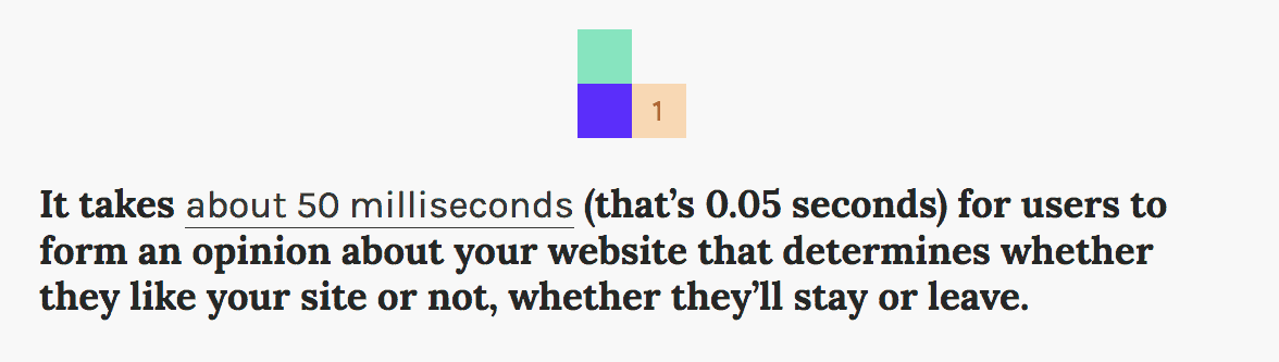
Your website menu has one simple task: it is designed to help users find the content they’re searching for. It should be intuitive, and simple to use. If you’re struggling to find the information you’re searching for when using a website for the first time, chances are you will leave the site without making your purchase. And you probably won’t be back. According to Sweor, it only takes users .05 seconds to form an opinion about your website. That means, if your website design (including your website navigation) isn’t up to current standards, you could be losing sales in less than one second.

How Can A Good Website Menu Design Increase Ranking?
Having a website that is simple to navigate will not only increase your rankings, but it has also been proven to increase your number of leads into conversions. When people find your site is well designed and easy to use, it actually increases your credibility and they feel safe making purchases on your site. Most of the time, they actually return to purchase again.
A great website menu design can also increase your search rankings for a more technical reason. Search engines (like Google, Yahoo, etc.) have developed “site crawlers” (little bots that read, organize, and index information on the internet) in order to display the most relevant results for the things people are searching for.
A well organized website menu design makes it easier for those crawlers to comb your site’s content and index your pages. They index the location and content of your website pages, how often they are updated, and the importance of that page as related to other pages on your site (again, based on what people are most commonly searching for). When your website is categorized and well-organized for crawlers, your content is more likely to get ranked in search engines.
Now we’ve established the benefits of a well-designed website menu. So here are our best practices for creating your own website navigation bar design.
1. Planning
f you’ve noticed in our past blogs, this is almost always the first step we write about. Any good business strategy takes careful planning and preparation. You don’t just want to jump into your website navigation, because there are a lot of different elements to consider.
When considering your website menu strategy, it’s important to ask two questions:
A. What kind of features/products/services does your website offer?
B. What is the hierarchy in which those features should be displayed?

The goal of your website menu should be to navigate users to your best and most productive features as quickly and easily as possible. It’s purpose is to help guide visitors through the buying journey.
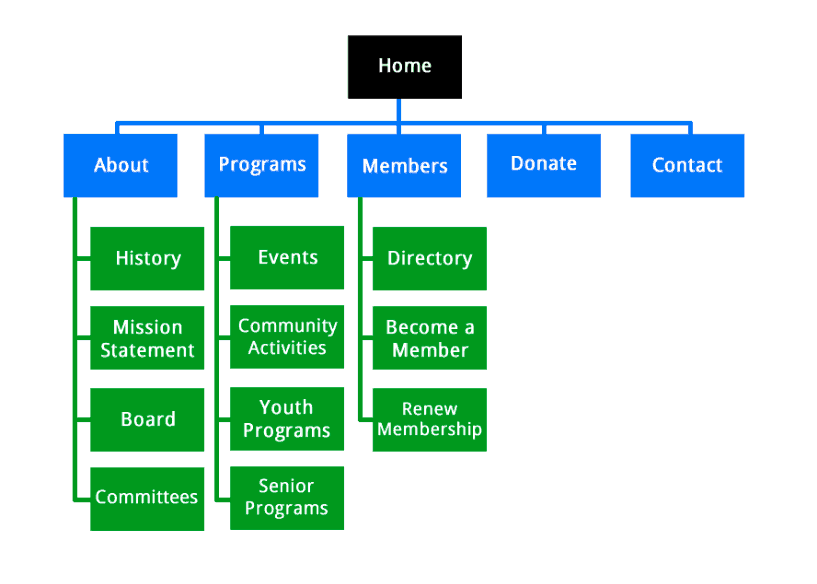
In its’ earliest stages, a website menu design is called a sitemap. There is no exact formula for creating your sitemap. It can be a spreadsheet, a list in a word doc, or even a diagram drawn on a piece of paper. Just use whatever format feels most comfortable for you. We love this digital diagram from Quicksprout.
It all starts at the homepage. You can have some great landing pages on your site, but for site navigation purposes, your base needs to be your homepage.
From there you can determine your hierarchy. Which features are most important for your customer to have access to? Which products or services would you like to highlight? What does your ideal visitor need to know?
It’s always important to determine how many website drop down menus you want to display: too many options make for a site that is confusing to navigate, and can overwhelm users. Make sure, in this planning stage, that you’re always thinking about creating a positive user experience. According to Search Engine Journal you should be able to navigate to any page on your website in three clicks or less.
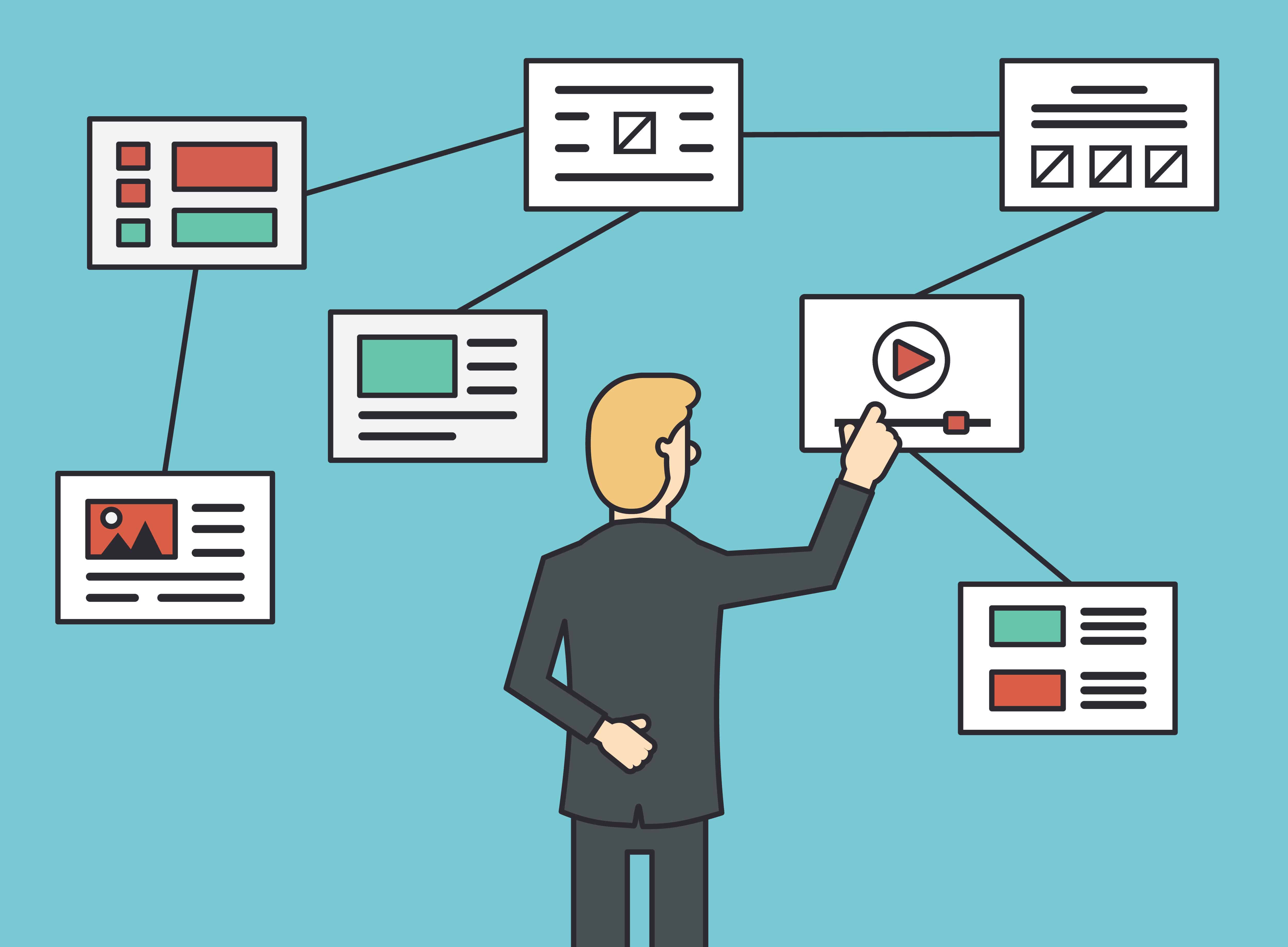
For a basic guide on understanding website structure and navigation, just to get you started on your planning journey, check out this quick video.
2. Design A Mobile Friendly Website Menu
Nearly 60% of Google searches are now taking place on mobile devices. If your website and menu aren’t formatted for mobile, you could be missing out on half your potential viewers and sales.
Keep in mind that many mobile phone screens are only 720 pixels wide in portrait mode. It’s important to design a menu that is easy to read, even in that small space. Choose clean fonts, and keep information short and sweet. And it’s always important to feature your most important items, products, or services first. The less scrolling your visitors have to do, the better.
Google is also moving to a mobile-first index, which means that Google will be taking your mobile-friendliness into account when considering your site for rankings. For some tips on increasing the mobile friendliness of your site, check out this clip from Bruce Clay.
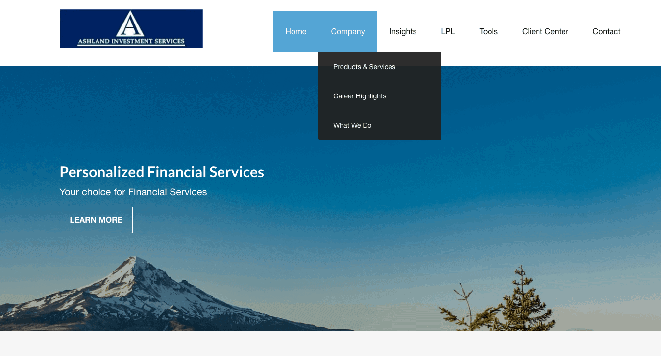
3. Follow Website Navigation Conventions
A few weeks ago in our blog with tips for merchandising your website, we went over the importance of following conventions. eCommerce conventions have more or less dictated how website navigation menus should appear in order to optimize your customer’s user experience. Since users have grown used to website menus looking a certain way, they will feel most comfortable using a menu that continues to follow those conventions. Reinventing the wheel could cause confusion, frustration, and negatively affect your customer experience.
Users are used to a website navigation bar appearing at the top of a website, or perhaps in a column along the left margin. If a customer were unable to find the website navigation bar to guide them through the site, they are likely to get frustrated and leave the site altogether.
4. Be User Friendly
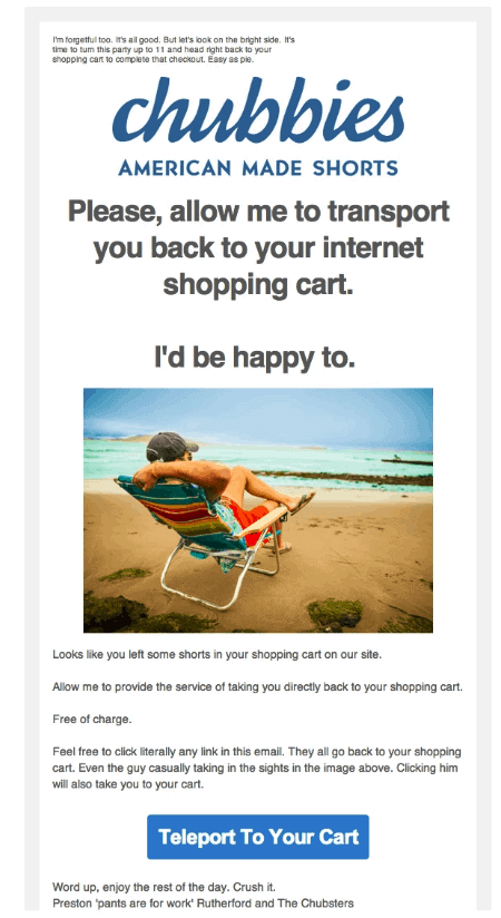
A great menu is going to be descriptive, intuitive, and also use language that your ideal visitor will be most comfortable with. Whenever you’re interacting with your visitors, it’s important to remember your brand and the language you want to use to communicate your brand to your customers. If you sell American made shorts, for instance, your persona can be casual and comfortable. But if you’re running a professional investment firm you’ll want to keep your language courteous, but professional. Know your audience, and make sure the language you use – even with your website navigation – matches your ideal visitor.

5. Analyze, Analyze, Analyze
Again, we talk about this step in almost every blog we write. Whenever you’re working on website design, the “digital ink is never dry.” A few weeks after launching your website navigation bar or website drop down menu use an analytics tool (find lots of great tips and a full guide to Google Analytics here) to go back and evaluate your successes and failures. Check your behavior flow reports and in-page analytics to see what percentage of visitors are visiting each page, and how long they stay.
Track what’s working and what’s not, and never be afraid to make adjustments. The goal of a navigation menu is to get your visitors through the buying journey as easily as possible. Be willing to retool and rework until you think your customers are finding exactly what they need for an incredible shopper experience.
At epicShops, we have access to some of the most intricate analytics tools on the market. We can not only monitor your site for traffic and success rate for your navigation menu, we can also monitor your competitors. What they’re featuring, how well their pages are performing, where their marketing focus is, and more. If you’re unsure of where to start with your website menu strategy, contacting us is a great place to begin. With over a decade of experience with SEO analysis, marketing, website design and structuring, we are here to help your website reach its’ fullest potential. We manage accounts in industries ranging from flower shops and apparel to medical services and heavy machinery. We know our stuff, and we can’t wait to partner with you and your business. Contact us today to see how we could help you get started with your website navigation bar design, or any other website needs or questions you may have!